Tag Archive for: Speckyboy

Mix and Match Typography Example

Typography has become more important in web design than ever before. Technological advancements have made it possible and practical to use nearly any font that you want on the web.

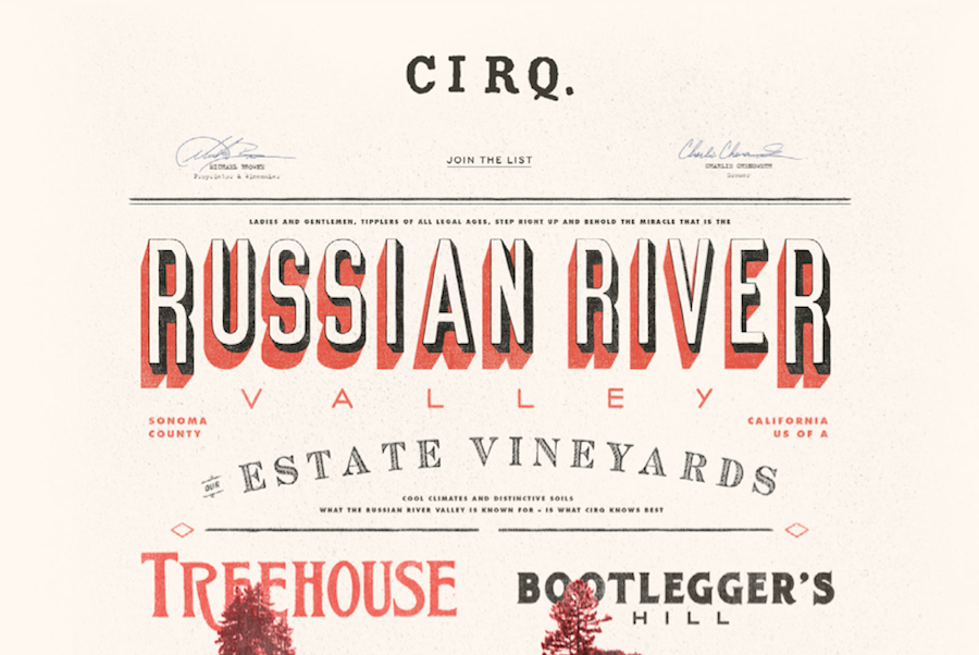
With the rise of interesting and well-thought out typography in web design, we have also seen new trends popping up in how people are using this typography. The first and most notable instance of this is the wave of retro typography on vintage style websites that is still prevalent across the web.

A newer trend we are starting to see has been around for a while in other types of design, but it becoming very popular for websites who want to establish their brand in bold and visually interesting ways. This “Mix and Match” typography relies on the designer’s ability to choose the right fonts to complement not just the message, but the other typographic styles in use.

Some designers opt to use subtly different fonts that are only minutely unique from each other to establish a visual hierarchy of interest while maintaining cohesiveness. Others opt to go all out and harshly contrast fonts against each other to create a visual friction and energy.

Marcin Treder collected 15 examples of this “Mix and Match” typography so you can get some inspiration to try out the style yourself. The rule of thumb for using fonts in web design has long been to never use more than three fonts in a design. It is clear that modern designers are finding ways to break that rule while creating classy and attractive designs.

Sidr jQuery Plugin

Navigation has always been one of the most important aspects of a website’s design. If you can’t move throughout the site, chances are you won’t use it. However, navigation is also one of the few site design aspects with no tried and true solution. What might be right for me, may not be right for you.

Of course, there are some pretty good criteria you can use to judge what type of navigation you need. A small site can get by with a simple drop-down menu or the basic “three line” toggle menu. Larger sites have a much trickier task. They can use “mega menus” for their desktop version, but they will need another option for the mobile site.

Thankfully, most menus aren’t created from the ground up, so you can experiment fairly easily. Paul Andrew from Speckyboy compiled 15 jQuery plugins for navigation. They’re even responsive. Once you’ve found the one that matches the needs of your site, you can customize it and make it truly feel like a part of your website.

Paper Fanatic Style

Source: Speckyboy

Gathering inspiration is the first step of almost every design job, and those of us really invested in design are doing it constantly. We take inspiration from signs in store fronts, billboards, other websites, nature, photography, videos, and everywhere else we can. We are literally surrounded by inspiration at all times, which we then filter through our own tastes, skills, and preferences to deliver our take on what inspires us.

Those innate preferences can have a big effect on what we turn in. Some designers are drawn to grungy, dark looks, while others like the sleek modernism that results from a mix of 70’s sci-fi design and current modern art sensibilities. Others opt to go an entirely different direction, directly playing with retro styles and designs.

Normally, we take these inspirations from the world around us and apply them to the screen. Even as skeuomorphism is dissipating as the leading design style practice, we use our environment and the images we’re exposed to for our designs. It doesn’t have to be linear. Even flat, minimalistic designs can be inspired by the colors of nature or the mood of a relaxed summer day.

But, what happens when you take inspiration from graphic and web design and apply it to real life? We obviously can’t put a filter on a bike ride or sunset (though good sunglasses can come close), but architectural design often incorporates graphic inspiration into physical objects and environments which can make you feel as if you’ve stepped directly into a design style.

Speckyboy contributor Victor Balasa took this idea and collected several buildings and architectural designs that portray real-life versions of web design styles we play with every day. There are grungy interiors that portray the gritty hardline style of grunge web design without sacrificing class, and even the “paper fanatic” style you would never imagine could come to life. If you ever wanted to know what the world could look like if it was styled by grahic designers, these images can give you a pretty interesting depiction.

Tools, templates, plug-ins, and script libraries are all a huge part of web design. If we create absolutely everything from scratch, we often end up spending way more time than necessary to get the same results. We keep complete creative control, while streamlining our process to keep our work fast enough to keep clients happy and stay competitive.

So many tools come out every month, that some websites run weekly round-ups of all the new fancy toys we can use to make beautiful websites without draining all of our time and energy on individual products, but this also means many great tools get lost in the mix, or downloaded to be used once and forgotten.

To keep you from wading through duds, out-dated tools, and countless versions of tools that achieve essentially the same thing, Speckyboy collected 50 of the best resources and tools that have been released over the past year. Time is priceless to designers and all of these tools strive to make sure every minute you spend designing counts.

Reading a BookOver the weekend, I got on a reading kick, but often the biggest challenge in those instances is picking the best book to start up. Of course, you could always try to trudge through A Song of Fire and Ice, or some other fiction, but lately I’ve been hoping to get a little more out of my reading.

Thankfully, there are practically an unlimited number of books for designers and developers that there is no shortage of information or discussion for me to choose from. The best part is, the most recent wave of books have almost entirely been ebooks that cut out all the production costs and are available for free.

You can look into any design topic you want and almost certainly find a book focused on that idea. Whether you want to learn a new coding language, research the latest trends, or learn some historical perspective to inform your designs, there is undoubtedly a book on it. Rather than making you do a lot of Googling and vetting to pick the best book for your interest, Paul Andrews put together a list of 19 free ebooks that cover everything you want to know.

Some of the ebooks are simple guides like Mobile Web Design Best Practices from Mobify which (as the title suggests) walks you through 50 of the best ways to build the best mobile site possible. Similarly, you could check out Web Design and Mobile Trends for 2013 from Awwwards if you are looking to catch up on what is all the rage right now.

There are also much more in-depth texts you can dig into such as Learning JavaScript Design Patterns by Addy Osmani. The ebook teaches designers how to write beautiful, organized, and most importantly, maintainable JavaScript through the application of classical and modern design patters to the language.

Whether you’re looking to pick up a new skill or refine and improve your existing ones, there’s an ebook that will take you from start to finish with half the headaches of digging into a myriad of tutorials and online articles from a whole bunch of conflicting sites and writers.

Flat Design IconsFlat design doesn’t seem to be going away. The popular use of pastel colors and minimalistic layouts is getting bigger every day, and even the biggest proponents of skeuomorphism (ahem, Apple) seem to be caving to the new focus on designing for the screen rather than designing based on the physical world.

For many designers, this might mean an entire overhaul of your site if you are trying to stick with the trends. However, before you go banging your head against the wall about having to build your site from the ground up, remember that any big web design trend probably has tons of free resources already available to help speed up the conversion.

This is obviously the case with flat design, and while there are scripts to help with making a flat web site responsive or managing navigation, there are also free sets that will help you fill out the details of your site with any icon you need in a style that will match your new page.

Speckyboy recently compiled twenty free icon sets that will help with navigation, social sharing, or payment methods that your users will be seeing. Designmodo also created their own personal set of icons they shared wih their readers designed specifically for social media and sharing.

The icons are all high quality, resizable PNGs or PSD files, and you won’t have to worry so much about the tiny details while you’re working on the bigger picture of your site. Oh, and don’t be confused if you think many of them look like app icons. Rounded corners and geometric shapes are a big part of flat design.

CSS lets us do wonderful things as designers, but it can sometimes be a hassle. If you are super experienced, you may have learned to avoid the problems, but the majority of us are way to accustomed to beginning with a very simple CSS file, and watching it spiral out of control as you continue development.

As you create your site, your CSS gradually becomes a mess. It looks disorganized, borderline unreadable, and there are inevitably quite a few mistakes spread throughout. It doesn’t mean you’re a bad designer. In fact, this could happen to anyone.

Usually there are two ways to deal with this, you can either regularly stop your site development and clean up the CSS, or you can wait until the end and dive into fixing everything all at once. Either way, it takes forever.

Recently, a third (much faster) way has come up. Why not just use a tool to keep your CSS sorted and formatted? No tool is going to keep your CSS looking perfect, but they can at least keep it organized enough to be readable when it becomes time to edit, and you won’t have to do near as much editing as you did in the past.

Speckyboy Design Magazine collected a whole bunch of different options for keeping CSS code looking clean while you work. While none of them will recognize your unique way of writing the code, but you should be able to find something that fits you well enough to make your life much easier.

Gumby 2

A month after their last version of the responsive front-end framework, Gumby, was released, Digital Surgeons has launched a complete re-imagination in the form of Gumby 2. There are of course tons of new features, and it was rewritten in Sass to make the tool framework more customizable.

As Speckyboy Design Magazine tells it, the original version of Gumby came out of frustrations with trying to migrate to a responsive web design process. Gumby 2 takes their initial solution and makes it more efficient and useful for a variety of different front-end development problems.

One of the new changes in full integration with Google WebFonts which makes embedding custom fonts into your prototypes and sites a breeze. Rather than dealing with licensing and hosting issues, all you have to do now is drop a link or create a custom build. You can have all the typographic flair you have always wanted without all the old hang ups.

It also comes with a UI Kit so that you can build numerous UI elements quickly. Buttons, tabs, forms, and navigation can all be prototyped and customized to fit your site and Gumby 2 offers different styles so that you can pick what best suits your design.

Gumby 2 also helps you hop onto design trends such as Symbol or Icon Fonts. These fonts are sets of symbols to be used for navigation or general iconography. Instead of maintaining huge databases of different icons in various sizes, symbol fonts can be resized endlessly in the same way font characters can be. Gumby 2 comes with the symbol font Entypo by Daniel Bruce, which should cover all the needs of most websites.

Another useful trend that Gumby 2 integrates is responsive image capabilities so that mobile users and computer owners with high density displays see a pretty layout instead of pixelated, blurry images. Responsive frameworks tend to take care of all the layout needs, but they generally leave images and iconography behind. Gumby changes that by making the use of retina images intuitive with a simple attribute on an image tag.

While some frameworks may handle individual problems better, especially for more development minded people, Gumby 2 offers a wide solution for many problems which designers trying to transition to coding will doubtlessly appreciate. It saves time and helps ease you into the world of development without too much pain.