Minimalism is all the rage in web design at the moment, and extra negative space is an essential aspect of the style’s aesthetic But, is minimalistic design and the white space accompanying it just a trend or is there more to it?
To the more business minded designers, all the “empty” space could be used for ads, more content, or more usability features that guide a user through the site. If you compress the amount of space between images, columns, and every other visual component, in theory you can fill the page with more of what users want to see, right?
That mindset favors business, but it doesn’t favor aesthetics. As Carrie Cousins puts it, “space is the thread that holds your design together.” White space separates objects, letting users find what they want to more easily. Space between objects groups things together, and it creates a sense of balance that makes a design seem cohesive and professional.
For most designers, there is a rule about keeping white space around content for the sake of making it more readable, but the same is true for just about any aspect on the screen. It draws attention to the most attractive aspects of a site by singling them out from others, while also organizing your site.
Neglecting negative space can make your site seem busy, cluttered, and hard to comprehend. While filling extra space with adds, or squishing everything together to present the reader with more seems like a good idea, in reality less is often more. Readers don’t want everything at once, they just want to be able to easily find what they’re looking for.
But, minimalistic design is not even close to risking using too much white space. Most designers are already thinking about using small amounts of negative space to organize content, but the new design trend is taking that idea to its extremes.
Using huge amounts of white space can have its problems. While it can be used to create stark contrast, white space can also make objects feel small, or detached from the rest of your design, unless you make your negative space feel deliberate.
White space draws attention to one object in a way so forceful users can’t help by stop and notice the object floating in a sea of space, but it is possible to go overboard.
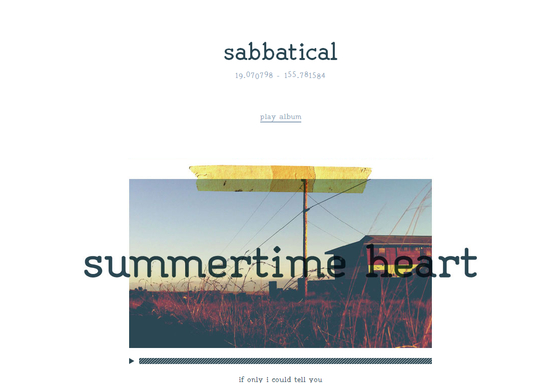
Good use of white space makes the “empty” space feel active or purposeful. Bad white space makes a page feel empty or incomplete. The best place, or at least the most common area, to use white space is the header. When a viewer lands on a site with a lot of negative space in the header, they are met with a striking and simple statement of what the site is all about, all encapsolated in a singled out set of images or text.
If you use negative space in the header, the limits white space can put on content are removed, because content still flows fairly traditionally underneath. Many clients worry about forsaking content for “empty” space, but if the content focused areas of the site still present everything clients would expect to find, negative space won’t detract from the design.
However, if users can’t find what they are looking for on a minimalistic page, they might place the blame on the amount of space not being used to provide a better navigational system.
Not every site needs a minimalistic or negative space heavy approach. These aesthetics are tools just like everything else in a designer’s repertoire, to be pulled out when the time is right. You don’t have to start at the extreme end. Just try letting your content breathe a little and see how you like it.
