Any SEO professional who has been around for a couple design trends knows what its like to bump heads with designers about the design methods and usability. There are certain innovative design trends that can be wonders for usability, but are completely at odds with standard SEO practices. According to Janet Driscoll Miller, that doesn’t mean we have to throw out both, we just have to be creative with our solutions to integrate creative design.
Parallax design is the most popular trend that runs into this issue with usabilty and SEO. It has actually been around for a few years, but it has recently gained quite a bit of notoriety as designers have used it to animate pages in a way that scrolling makes the entire page change what is being shown. It’s really easier to show people than to describe.
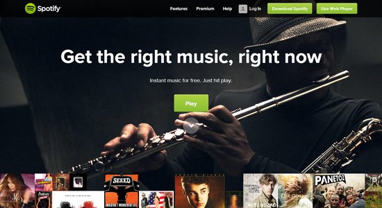
The most commonly seen site with this design style is the Spotify front page which essentially moves layers as the viewer scrolls downwards.
What makes parallax design so popular is it basically allows the site to walk a visitor through a story by scrolling down the page. Google has even used the style for their big “How Search Works” site, where Google tried to explain how it works to the average internet user. It directs how visitors view the site, rather than letting visitors click around at will.
The big problem is that parallax designs are essentially extremely large one page websites, which is extremely difficult to optimize for many search terms. All of your keywords have to be concentrated onto one page, rather than spread out across many as Google is used to. On top of that, inbound links to your site all point to a single page, not specific content.
Another interesting problem is that parallax design doesn’t work on mobile phones of any kind. As mobile traffic rises, that means more and more people aren’t able to use pages in this style. It also means site owners have to basically create an entire separate mobile version of their site. Many companies already do this, as Google did for the “How Search Works” site. Until responsive design popped up, it was common practice to build a second mobile site.
None of this means we should immediately cut out parallax design. As stated before, parallax design is unparalleled at telling stories, and some site don’t have to rely heavily on SEO to drive traffic. There is also an approach which allows you to use parallax design and a multipage site, by creating accomying sub-pages, like Spotify did. The home page is a parallax design, but the links take you to content on separate, static pages. That creates a static URL for different content and allows keywords to be more spread out.
Deciding whether or not to hop on these trends all depends on what you intend to achieve with your site. If you intend to tell a story or direct visitors through your site in a linear fashion, parallax design is possibly the best answer.
