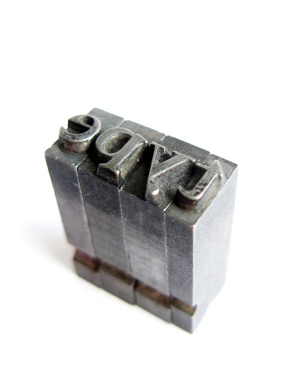
There are infinite ways to approach typography, and you will see just about every imaginable strategy across the internet. Some go over-the-top with their typographic choices, and some, either out of ignorance or laziness, underwhelm with blah text.
There are places for both of these approaches, but there is never an excuse for outright ignoring how your text looks on-screen. Typographic choices are absolutely essential to your design, and even if you don’t have much text on your page, the wrong typographic decisions can leave viewers with a bad taste in their mouth.
To keep you from making the mistakes many pages have, I’ve compiled a list of things to keep in mind when choosing typography for your designs.
Message
One of the first things a designer should consider when starting a design is what type of message you want to send. This should be equally true when it’s decided what text you are going to use. Gabi Azilla uses the example of fliers for disaster aid programs when considering what message you want to send. In this example, you want your message to be along the lines of “hope” and “aid”, so you don’t want your text to look like something from an action movie or business memo. If that example is too specific for your current project, think along the lines of whether your design is aiming for a happier, or darker concept. Happy designs should use light, soft fonts, while darker themes rely on sharp, dramatic text.
Legibility
It really doesn’t matter what you are working on, using text that is illegible is always a negative. It may look neat, but nothing annoys viewers quicker than having to struggle to read a simple header. There are times when more abstract fonts can be good, but they should be used very sparingly for effect, rather than the main font for any aspect of your page. Think about it in terms of the heavily illustrated letters beginning paragraphs in classic, old books. They liven up the entire page, but the illustrated, complex area of text only covers one letter.
Size and Placement
This one goes overlooked often, but where and how big your typography is has a huge effect on the success of your design. Placement and size are all about balance. No one wants to strain to read your text, and overly large text is just annoying, but you also want to make something eye-catching. Make sure the typography complements the rest of the design, and effectively uses the space it covers. The general rule for designers is the header or title area should be the main focus, and everything else should be roughly half the size of the header, or smaller depending on importance. Keeping a heirarchy in your text lets readers know where you want their eyes to focus.
Conclusion
With the near infinite choices designers have for typography, it is easy to want to dive in and play with your design to create something truly wild. There is plenty of room for experimentation and innovation, but restraint is key. Remember why you are designing the current project, and fit your typography to match the point of the design.


