Tag Archive for: design tips

Retro Icon

Source: Designrfix

Web design has a love of all things retro. You can’t scan the web for long before you come across a site with faux wood textures or faded and breezy images influenced by the aesthetics of another time. These old styles are even large parts of current design trends such as flat design and the new found focus on typography. Designers are constantly taking the old and turning it new again.

Some choose to lean more heavily into the retro styles than others. While many flat designs owe debts of gratitude to minimalist styles of the 50’s and 60’s, you usually wouldn’t confuse the two. Others however do their best to emulate the styles of earlier times as closely as they can, but translated into a digital medium.

Going retro is a popular style for many brands and artists, and it isn’t any more difficult to achieve than most other current design aesthetics. Designrfix recently shared tips to really get the look and feel of older times, if you want to try it out for yourself.

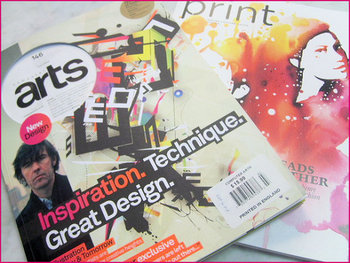
Think Retro – The first step is getting inspiration. It can be difficult to detach yourself from your contemporary ideas of good style, and the best way to do that is go directly to the source. Search out old magazines and newspapers, any sort of graphic media from the time you can find. There is a huge amount of it online, and you’ll be able to get inspired within just a couple searches.

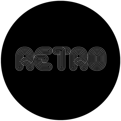
Focus on Simple Shapes – Vintage and retro styles are characterized by simplicity. Designs of the past relied on impact to grab attention, and this was usually achieved by using very simple shapes like circles which demand attention. Consider a circle surrounded by decoration, or blocky and heavy arrangements.

Limit Your Use of Color – Modern designers have it easy. We can use any assortment of colors we want on the web, even down to slight shading choices. Designers of the past were limited by the expense of full color printing, so they often relied on two-toned coloring to come up with colorful designs without breaking the bank. Using black-white, orange-yellow, or cream-brown color combinations will immediately make viewers think of older printing styles.

Retro Typefaces and Fonts – As previously mentioned, big typography in retro styles is an absolute necessity of a vintage site. The style has grown some legs on its own, but it still is a defining trait of older styles. You need to choose a font reflective of the era you want to reflect. Using the wrong typeface can seem anachronistic or lazy, so take your time and get it right. Check what designers were using in the era you’re emulating and find something similar online. It shouldn’t be hard to do so.

Borders – Borders have always been a big part of design, and ornamental borders were definitely a big part of making older designs attention grabbing. Frame your images and content in borders and simple shapes and you’re site will already look pretty retro.

Badges – Interestingly, if you look at websites with retro designs, you tend to see lots of badges as buttons, even though badges weren’t actually a big part of designs in the past. Still, these badges remind users of county-fair days and older times, while also standing out on the page and drawing attention. It is a simple addition that works better than it should.

Using the Right Texture – Well used textures can make a boring page feel stoic and formal. They can entirely define how a page feels, and can certainly make a page feel more retro. The trick is subtlety and integrating the texture into the layout, not simply laying it over things.

MINOLTA DIGITAL CAMERAFew new designers appreciate how important design briefs are. It usually takes a few years and a couple frustrating and seemingly directionless projects to realize how effective briefs are in giving a designer good direction, and saving designers from numerous redrafts.

Even once you realize how importance a design brief is, many designers have trouble integrating them into their practice. How do you get that type of information out of a client? What do I ask?

That last question is probably the most notable. Asking the right questions can give you all the information you need to make a great finished product, but you have to know what to ask. In Claire Roper’s opinion, it only takes ten questions to make a great design brief.

Of course, even if you followed Claire’s rule, you’ll find yourself asking way more than that. For example, if you ask your client, “what do you want to achieve with the design,” there is no way for a client to respond that won’t solicit at least five follow up questions from a good designer.

The goal of a good design brief is to collect as much information as possible from your client to know what they want out of a project, and that involves asking questions you might not otherwise consider. You want to learn everything about the company you are representing, their history, and how they do work, but you also want to learn exactly what they like.

Asking a client to show you designs they like may seem like the first step to plagiarism  but its far from it. As a designer, your tastes are likely different from your client, and you need to know what each client likes. Asking them to show you what they like and dislike will give you a better idea of what you are trying to create and what to stay away from.

While you can start out with ten questions to ask clients, don’t stop there. Ask questions until you feel confident you understand the desires of your client and their business as a whole. These ten questions will get you going, but if your client isn’t bothered by answering twenty-one question, you should ask as many as you need.

Magazine DesignSometimes I find myself, as well as plenty of others, writing about web design as if it is entirely separate from other mediums. Sure, there are plenty of things that distinguish web design, such as coding and even specific layout patterns for the internet, but there are a lot of principles of layout and design that can be easily transferred onto every medium.

Cameron Chapman got her start in magazine publishing, but she is now a web and graphic designer and prolific blogger. She knows better than anyone that good design rules can often transcend the medium they were established in and help designers across the board. She used her experience in magazine publishing to choose a few design principles that almost any design grad has heard and shows how easily they can be applied to web design.

The first principle seems to be common sense, but a simple background makes reading easier. This is why magazine background colors are almost always white, or at the very most a simple solid color. Readers give up if text is hard for them to read, but yet some less well known websites still present their text over busy images or colors without enough contrast to offset the text. Even if your page’s background is a large image, it is easy to offset your text with a simple text box to deliver your message.

Some websites have numerous pages that all look like different versions of a website. The “about” page may be professional looking and understated, while their “services” or “product” pages are vibrant and sometimes cluttered. If you look at a magazine, every page or section retain several cues from other areas of the magazine. Fonts remain the same, layouts are fairly standardized, and images are shown in the same style. While each page of your site can be a little different from others, it is important to establish consistency by presenting the bulk of your information in similar formats.

One of the most important rules that websites break all the time is clearly marking advertising. In magazines, it is tradition to clearly separate the advertising from the actual content. Even if the advertising is designed to match the style of the magazine in some ways, as some magazine ads have begun doing, there are clear labels added to ensure readers know where the articles end and the ads begin. The same should be implemented in web design, but some sites allow their ads to either be entirely intrusive or sometimes indistinguishable from the content. When readers can’t tell if you are selling them something or delivering them information, they stop trusting your content.

There are plenty of other design rules that web design can learn from, and Chapman explores more of them in her article for Web Designer Depot, but she doesn’t want you to focus on the specific rules she outlines. The most important thing she hopes for you to understand is that any design rule you learn should be at least experimented with in other mediums. Sometimes it won’t transfer well, but most of the time it will make your site look better.