 Sometimes I find myself, as well as plenty of others, writing about web design as if it is entirely separate from other mediums. Sure, there are plenty of things that distinguish web design, such as coding and even specific layout patterns for the internet, but there are a lot of principles of layout and design that can be easily transferred onto every medium.
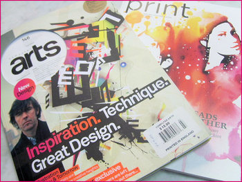
Cameron Chapman got her start in magazine publishing, but she is now a web and graphic designer and prolific blogger. She knows better than anyone that good design rules can often transcend the medium they were established in and help designers across the board. She used her experience in magazine publishing to choose a few design principles that almost any design grad has heard and shows how easily they can be applied to web design.
The first principle seems to be common sense, but a simple background makes reading easier. This is why magazine background colors are almost always white, or at the very most a simple solid color. Readers give up if text is hard for them to read, but yet some less well known websites still present their text over busy images or colors without enough contrast to offset the text. Even if your page’s background is a large image, it is easy to offset your text with a simple text box to deliver your message.
Some websites have numerous pages that all look like different versions of a website. The “about” page may be professional looking and understated, while their “services” or “product” pages are vibrant and sometimes cluttered. If you look at a magazine, every page or section retain several cues from other areas of the magazine. Fonts remain the same, layouts are fairly standardized, and images are shown in the same style. While each page of your site can be a little different from others, it is important to establish consistency by presenting the bulk of your information in similar formats.
One of the most important rules that websites break all the time is clearly marking advertising. In magazines, it is tradition to clearly separate the advertising from the actual content. Even if the advertising is designed to match the style of the magazine in some ways, as some magazine ads have begun doing, there are clear labels added to ensure readers know where the articles end and the ads begin. The same should be implemented in web design, but some sites allow their ads to either be entirely intrusive or sometimes indistinguishable from the content. When readers can’t tell if you are selling them something or delivering them information, they stop trusting your content.
There are plenty of other design rules that web design can learn from, and Chapman explores more of them in her article for Web Designer Depot, but she doesn’t want you to focus on the specific rules she outlines. The most important thing she hopes for you to understand is that any design rule you learn should be at least experimented with in other mediums. Sometimes it won’t transfer well, but most of the time it will make your site look better.
