Just like every aspect of design, color is subject to trends and fads, though they aren’t always obvious. Look around a city and you’re hit by a wave of color so various it is hard to make heads or tails of what color palettes are popular at the moment. Start to hone in on the individual elements however, and soon you’ll see patterns in the different billboards and store fronts that litter the landscape.
The same goes for web design. If you are looking at the entire web as a case study, it is hard to tell what is popular right now. If you pay attention to the trendsetters and heavy hitters though, the trends are pretty clear. Luke Clum from Web Design Ledger selected four color trends he has seen coming up this year, and they are indicative of many other fads going on right now.
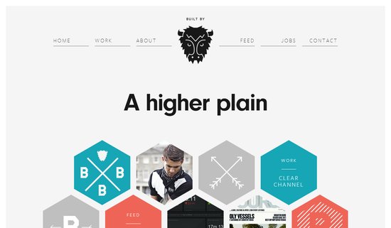
1) Grayscale with Colorful Accents – Designers have long understood the use of bright colors on muted backgrounds to provide points of interest and direct the eye along the page. Lately, this has been refined to an art. Grayscale palettes give sites an air of sophistication while the brighter spots of color help differentiate between different aspects of the page and important content.
2) Muted Pastels – For sites going with the grayscale with accents palette, muted pastels are often the hues of choice for those accents. A desaturated robins-egg blue or grayed out purple still jump off largely black, gray, and white pages, without throwing off the balance with overly saturated brights. These muted colors also work well with creating formal web presences, or more vintage artisanal brand images when accompanied with retro typography.
3) Neons and Brights – On the other hand, while a large group is going muted and reserved, other designers in fashion and visual mediums have been moving towards loud neon colors that scream 80’s throwback. Bright pinks and electric blues are showing up more and more places, giving businesses a perceived image as modern, energetic, and engaging.
4) Color Blocking – This is the trend that unites all of these palette fads, as well as giving a view as to what is going on in web design as a whole. Breaking sites into distinct, but aesthetically pleasing grids is one of the most irrefutable trends going on right this moment, and it all leads back to flat design. These crisp blocks of color help create an organization across the page, without separating every element with white space. It is reminiscent of illustration, minimalism design, and even the trend towards vector graphics. Plus, it can be combined with an other color trend for great results.
Conclusion
While the trends will always be changing, and some of these may not even still be en vogue by the end of the year, keeping up with what is happening across design is essential to the job, and following the latest color trends allows you to keep your site looking modern while experimenting with palettes and layouts outside of your normal wheelhouse. Sometimes, following trends will help get you away from your boring design routine.
