Do you understand how color affects your website content? Do you know color can affect how your site is interpreted by commercial search engines?
Most people don’t. Normally, for designers, color selection comes down to aesthetic preference or corporate color palatte. What they don’t realize is color selection can have a negative effect on your conversions if it isn’t well planned.
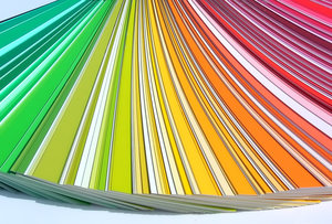
Shari Thurow examines the link between SEO and color selection in her article at Search Engine Land. Beyond impacting the usability of your site, color selection can cause different cultural understandings of your site. More frightening for the developers out there, improper color usage can even be considered search engine spam. Make sure you think before you paint your site the wrong colors.
There is one simple color rule that has helped me endlessly in my designs, and I learned it in junior-high school. Unless you absolutely need to, never use black. It sounds strange to many, but it is a rule I live by now.
When you see dark things, it is common to assume they are black. It is actually very hard to find things that are pure black. It is possible, but most of the common things you will think of aren’t. Roads, for example, are not black no matter how recently they were paved.
Not even shadows are black. Any good painter knows this. Shadows are tints of a background color, and they are pretty much never actually black. They also reflect what type of light is being cast.
Now the reason it is important to note how hard it is to find a pure black is because pure black always overpowers other colors by comparison. It just does not naturally sit with most color palettes.
This goes double for web design. Even in apps or sites that seem to have black as a prominent part of the color scheme actually use dark grays, which are muted so they sit better in the composition.
Ian Taylor Storm, co-founder of Segment.io, also warns about the importance of saturation. Adding some color to grays helps liven them up a little. If you have a really dark gray, saturate it really heavily. Light grays will only need around 3%-5% usually.
The design for Facebook is a great example of this idea. All of the grays are saturated with the trademark Facebook Blue. The same goes for Facebook’s apps.
There is always a time and place for pure black, but it should be a rare occasion. Usually, a more natural color will suit your needs much better.
00TMOhttps://www.tulsamarketingonline.com/wp-content/uploads/2018/07/TMO-Logo.pngTMO2012-10-15 08:45:052012-10-15 08:45:05Black Is Not Your Friend In Design