 Graphic design is fond of truisms. It might be partially because designers kind of cling to the few hard-and-fast rules we hear, or maybe we just let these common sayings get into our minds just like we internalize trends and styles. Either way, ask any twenty-something about graphic design and you will probably hear one of a handful of well-propagated lies.
“Comic Sans is the worst font ever,” is probably the one you’re most familiar with. There are entire blogs devoted to documenting and chiding every use of Comic Sans that the creator finds. Searching Comic Sans on Tumblr is just a stream of childish remarks insulting a typeface like “You should be ashamed of yourself, you used Comic Sans for the give-away and it hurts me to see” and hilarious tags like “#comic sans is the devil”.
According to Craig Ward, Comic Sans “is the typographic equivalent of an innocent man on death row.” It’s not a pretty font. That is fair. It isn’t “sophisticated” like many perceive Helvetica to be. But, what about all the other terrible handwriting fonts no one talks about? The illegible, the illogical, and other fonts that no one will devote a blog to?
Comic Sans shouldn’t be used on a high level brand by any means, and it may offend the pretentious palette but it actually serves a purpose. Comic Sans is more easily readable for people with dyslexia, which makes the use of the font on every office note ever make a little more sense, and there have to be some fonts for childlike designs.
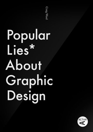
The Comic Sans truism isn’t the only one running wild through graphic design. I’ve quoted the old “less is more” philosophy more than once, and I’ve subconsciously adopted plenty others. None of that makes them any more true however. Most truisms aren’t. That’s why Craig Ward decided to take them on in his pocket-sized book Popular Lies About Graphic Design. He covers the Comic Sans debate, but he also challenges many other age old graphic design beliefs. He shared seven lies and his arguments against them over at Co.Design.