Tag Archive for: parallax scrolling

Parallax scrolling was on almost everyone’s list of predictions for this year, but the community has been oddly quiet on the topic for a little while, most likely because it requires more finesse than many of the other trends on the tips of designers’ tongues.

To use parallax scrolling, you have to thoroughly understand what it is and how to use it. You can’t just follow a simple tutorial. You have to design around parallax ideas which requires much more time and focus.

To see the effect in action, click the image.

To see the effect in action, click the image.

For those unfamiliar with the niche trend, parallax scrolling is a technique that happens when multiple layers of information and images are combined and move at different speeds to create movement, depth, or a 3-D appearance. What makes parallax scrolling different from other similar uses of this technique is putting the power in the hands of the user. Instead of an automated effect, the visitor controls the illusion with their mouse.

It is a tricky method to master, and requires quality resources to work properly. A great parallax scrolling page is easily ruined with low quality images. The scrolling can be vertical or horizontal. Though vertical scrolling is by far the more popular, horizontal scrolling is gaining a following slowly.

While it is difficult, parallax has some unique advantages over other types of designs. Many use the technique simply for aesthetics, but it also changes how users interact and read a webpage.

One of the easiest ways to see how parallax changes browsing patters is to look at its storytelling capabilities. Parallax scrolling can turn your average webpage into an interactive storybook that users can move through at their own pace. Where videos usually require sound and complete attention, stories can be told with parallax scrolling that puts the user in control, and won’t be as prone to get visitors in trouble when their at work.

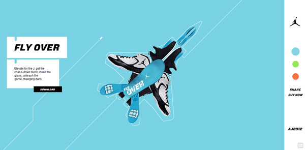
Parallax scrolling is also especially adept at showcasing products. Like an online catalog  parallax techniques can make it appear as if you are flipping through a group of products, or seeing multiple angles of the same item for a better idea of what it really looks like, all while keeping the focus directly on the product by putting it front and center.

Carrie Cousins from Designmodo has a few other ideas of how you can use parallax scrolling, but the best thing to keep in mind about parallax scrolling is, as Cousins says, “the backbone of parallax is user experience.” Parallax techniques engage and intrigue users in a way that makes them feel as if they are experiencing web sites in a new way entirely. Don’t squander it with bad UX.

We’re officially in 2013 now, and it is time to plan for the year ahead, if you haven’t started already. Planning means trying to predict the biggest trends that will hit design before they get here, which can be tricky, but there are plenty of lists already out there of people making their predictions.

The one I believe is the most accurate is Andrew Kuchariavv’s article on Intechnic. He starts with the same item that has topped just about every list I’ve seen, and seems less like a prediction than a statement. Yes, responsive and adaptive design will only be more important in the next year. There are a few drawbacks, but the bottom line is responsive design means a quality design will look good, if not great, on any display from an iPhone to a desktop.

Predicting parallax scrolling will be more common in 2013 however is a bit more of a reach. Parallax scrolling is a technique where multiple layers of a website scroll at different speeds, creating a 3D effect. For an example, check out Bagigia’s website. There have been sites with parallax scrolling for a short while now, but it is only now beginning to catch on, because it works great for product presentations and looks excellent on smart phones or tablets.

Probably my favorite prediction Kuchariavv made might be more of a hope than a foresight, but it is still fairly probable Flash could finally die in the next year. Javascript, HTML 5, and CSS3 enable just about every animation effect you could make with Flash, but without the need for plug-ins, and compatibility issues with mobile devices.

The next year looks promising for web design, and I personally am excited to see what comes out. There are always the new things we can’t see before they get here, but just these trends suggest websites will keep getting sleeker and more fun to use.


In a constantly changing industry, it can be difficult to predict trends for the future. For designers, this means heightened responsibility during transition periods. Designers have to be able to create client pleasing designs based on what has been popular this year, while also constantly learning new tricks to innovate for what is to come. Hopefully, these predictions can help you be prepared for some trends that should become popular within the next year.

  1. Responsive Web Design – At this point, this prediction is more of a foregone conclusion, as new kinds of mobile and desktop devices are constantly being released into the market. Each device has a unique screen size, proportion, and resolution. To create specific websites for each device would cost you a fortune in time and money, and responsive web designs eliminate all of these problems by responding to the size of the device accessing the page. Designers won’t need too make new layouts for different devices, when a single layout will work smoothly with all devices.
  2. Designed Typography – There have never been more fonts and variations for designers to work with than there is today, and choosing what typography to use is always an important decision. In the next year, it seems this will only become more important  and typography may finally cement its place as an essential part of design. Typography is the foundation of any website, and it is time it received recognition.
  3. Vertical Scrolling – Optimizing websites will continue to lead to crucial decisions for layouts. Many websites are still using vertical and horizontal scrolling, but through the next year vertical scrolling will become dominant. Vertical scrolling is convenient and easy. It also allows implementation of vertically scrolling buttons and header menus. All of these features combined make for user friendly navigation across your entire website.
  4. Big Buttons – More and more sites keep optimizing for “touch and tap” on mobile devices, which means buttons are getting bigger. Originally, these large buttons were being used to try to streamline pages and make them more visually pleasing, but they also make using pages on mobile devices infinitely easier. The only drawback is these large buttons require more graphics, which slow down sites. Hopefully designers can find ways around this, or this prediction may never come to full fruition.
  5. Branding Will Take a Hike – All business want their brand to be recognizable, and the year ahead of us seems more likely to focus on designing the brand, rather than trying to build a website based on the newest trends. Designers will choose things that complement the brand rather than choosing features that seem popular at the moment. It will become more important for designers to focus on translating a webpage business through the webpage and represent the brand’s image.
  6. Parallax Scrolling Will Rise – Parallax scrolling has been around for some time now, but it has mainly been used in video games  This year, it seems likely to finally transition to the web. This feature allows designers to control the depth of design objects on the webpage being designed.

While these are only predictions, many of these seem undeniably likely to come true. By studying what looks likely to become popular, you can be on the cutting edge of web design, rather than always playing catch up.

For examples of these predictions, check out Ali Qayyum’s article at Smashing Hub.