The TMO Blog

 https://www.tulsamarketingonline.com/wp-content/uploads/2020/01/GoogleRankings.png
360
640
Taylor Ball
https://www.tulsamarketingonline.com/wp-content/uploads/2018/07/TMO-Logo.png
Taylor Ball2025-08-12 19:59:452025-08-12 19:59:47Google Says AI-Generated Images Won’t Hurt Your Site’s Rankings
https://www.tulsamarketingonline.com/wp-content/uploads/2020/01/GoogleRankings.png
360
640
Taylor Ball
https://www.tulsamarketingonline.com/wp-content/uploads/2018/07/TMO-Logo.png
Taylor Ball2025-08-12 19:59:452025-08-12 19:59:47Google Says AI-Generated Images Won’t Hurt Your Site’s Rankings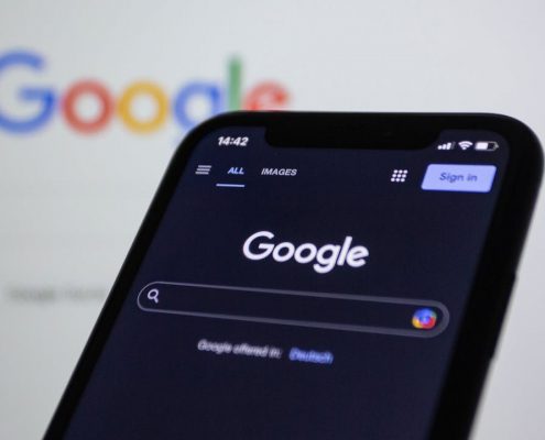 https://www.tulsamarketingonline.com/wp-content/uploads/2025/08/pexels-rccbtn-15406292-1.jpg
720
1280
Taylor Ball
https://www.tulsamarketingonline.com/wp-content/uploads/2018/07/TMO-Logo.png
Taylor Ball2025-08-01 16:30:292025-08-01 16:30:31Google Says You Don’t Need Special SEO For AI Overviews
https://www.tulsamarketingonline.com/wp-content/uploads/2025/08/pexels-rccbtn-15406292-1.jpg
720
1280
Taylor Ball
https://www.tulsamarketingonline.com/wp-content/uploads/2018/07/TMO-Logo.png
Taylor Ball2025-08-01 16:30:292025-08-01 16:30:31Google Says You Don’t Need Special SEO For AI Overviews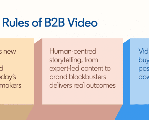 https://www.tulsamarketingonline.com/wp-content/uploads/2025/07/1752599598002.png
529
1200
Taylor Ball
https://www.tulsamarketingonline.com/wp-content/uploads/2018/07/TMO-Logo.png
Taylor Ball2025-07-18 19:31:242025-07-18 19:31:26LinkedIn Reveals The Recipe For Successful B2B Video Ads
https://www.tulsamarketingonline.com/wp-content/uploads/2025/07/1752599598002.png
529
1200
Taylor Ball
https://www.tulsamarketingonline.com/wp-content/uploads/2018/07/TMO-Logo.png
Taylor Ball2025-07-18 19:31:242025-07-18 19:31:26LinkedIn Reveals The Recipe For Successful B2B Video Ads https://www.tulsamarketingonline.com/wp-content/uploads/2023/10/MicrosoftAdsBanner.jpg
349
1130
Taylor Ball
https://www.tulsamarketingonline.com/wp-content/uploads/2018/07/TMO-Logo.png
Taylor Ball2025-07-04 19:52:192025-07-04 19:52:21Microsoft Ads Removed Over 1 Billion Spam Ads In 2024
https://www.tulsamarketingonline.com/wp-content/uploads/2023/10/MicrosoftAdsBanner.jpg
349
1130
Taylor Ball
https://www.tulsamarketingonline.com/wp-content/uploads/2018/07/TMO-Logo.png
Taylor Ball2025-07-04 19:52:192025-07-04 19:52:21Microsoft Ads Removed Over 1 Billion Spam Ads In 2024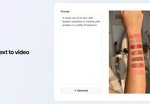 https://www.tulsamarketingonline.com/wp-content/uploads/2025/06/tiktok_image_to_video2.png
343
600
Taylor Ball
https://www.tulsamarketingonline.com/wp-content/uploads/2018/07/TMO-Logo.png
Taylor Ball2025-06-20 16:57:472025-06-20 16:57:49TikTok Adds AI Tools To Create Videos Off Text Or Product Images
https://www.tulsamarketingonline.com/wp-content/uploads/2025/06/tiktok_image_to_video2.png
343
600
Taylor Ball
https://www.tulsamarketingonline.com/wp-content/uploads/2018/07/TMO-Logo.png
Taylor Ball2025-06-20 16:57:472025-06-20 16:57:49TikTok Adds AI Tools To Create Videos Off Text Or Product Images https://www.tulsamarketingonline.com/wp-content/uploads/2023/01/AI-Content.png
1260
2240
Taylor Ball
https://www.tulsamarketingonline.com/wp-content/uploads/2018/07/TMO-Logo.png
Taylor Ball2025-06-06 14:24:222025-06-06 14:24:23New Research Shows SEO Is Key For Appearing In AI Overviews
https://www.tulsamarketingonline.com/wp-content/uploads/2023/01/AI-Content.png
1260
2240
Taylor Ball
https://www.tulsamarketingonline.com/wp-content/uploads/2018/07/TMO-Logo.png
Taylor Ball2025-06-06 14:24:222025-06-06 14:24:23New Research Shows SEO Is Key For Appearing In AI Overviews https://www.tulsamarketingonline.com/wp-content/uploads/2021/05/Google-Page-Experience-Desktop1.jpg
343
720
Taylor Ball
https://www.tulsamarketingonline.com/wp-content/uploads/2018/07/TMO-Logo.png
Taylor Ball2025-05-23 17:12:472025-05-23 17:12:49Google Executives Say Falling Referral Traffic Are Sign Of Higher-Quality Clicks
https://www.tulsamarketingonline.com/wp-content/uploads/2023/01/AI-Content.png
1260
2240
Taylor Ball
https://www.tulsamarketingonline.com/wp-content/uploads/2018/07/TMO-Logo.png
Taylor Ball2025-05-09 18:14:472025-05-09 18:14:49Google AI Overviews Appear In 13% of Searches
https://www.tulsamarketingonline.com/wp-content/uploads/2021/05/Google-Page-Experience-Desktop1.jpg
343
720
Taylor Ball
https://www.tulsamarketingonline.com/wp-content/uploads/2018/07/TMO-Logo.png
Taylor Ball2025-05-23 17:12:472025-05-23 17:12:49Google Executives Say Falling Referral Traffic Are Sign Of Higher-Quality Clicks
https://www.tulsamarketingonline.com/wp-content/uploads/2023/01/AI-Content.png
1260
2240
Taylor Ball
https://www.tulsamarketingonline.com/wp-content/uploads/2018/07/TMO-Logo.png
Taylor Ball2025-05-09 18:14:472025-05-09 18:14:49Google AI Overviews Appear In 13% of Searches https://www.tulsamarketingonline.com/wp-content/uploads/2021/04/youtube-logo2-1.jpg
190
707
Taylor Ball
https://www.tulsamarketingonline.com/wp-content/uploads/2018/07/TMO-Logo.png
Taylor Ball2025-04-25 17:33:442025-04-25 17:33:45AI Overviews Are Coming To YouTube In New Test
https://www.tulsamarketingonline.com/wp-content/uploads/2021/04/youtube-logo2-1.jpg
190
707
Taylor Ball
https://www.tulsamarketingonline.com/wp-content/uploads/2018/07/TMO-Logo.png
Taylor Ball2025-04-25 17:33:442025-04-25 17:33:45AI Overviews Are Coming To YouTube In New Test
