The Best Practices For Responsive Design [Infographic]
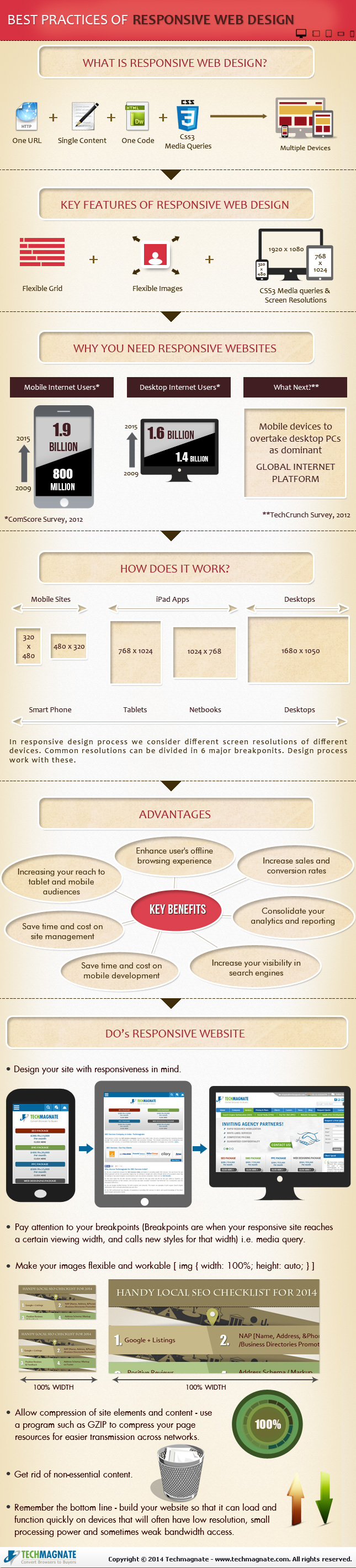
Responsive design is the popular title for a website designed to respond or adapt to users across multiple platforms. The idea is to make a responsively designed website equally as functional on your smartphone as it is on your desktop.
Of course, one way to make a website function properly on smartphones and desktops is to create a unique version of your site for each platform. What makes responsive design so special is its ability to take one site and make it work across devices, without the alternate versions.
With current estimates suggesting traffic from mobile devices may tie the numbers for desktop traffic, it is no mystery why it would be important for your brand to ensure your website is accessible and functional for everyone attempting to view it. Responsive design seems like the natural fit to solve this problem, and in many cases it is. But there are some drawbacks and problems you may need to be aware of before you start thinking responsive design is any kind of magic solution.
Tech Magnate created an infographic to explore the advantages and disadvantages of responsive design, as well as a guide for the common best practices used in the industry. If your business is online, but doesn’t have a site designed for a mobile experience, the infographic you see below can help you decipher whether responsive design is right for you.

Leave a Reply
Want to join the discussion?Feel free to contribute!